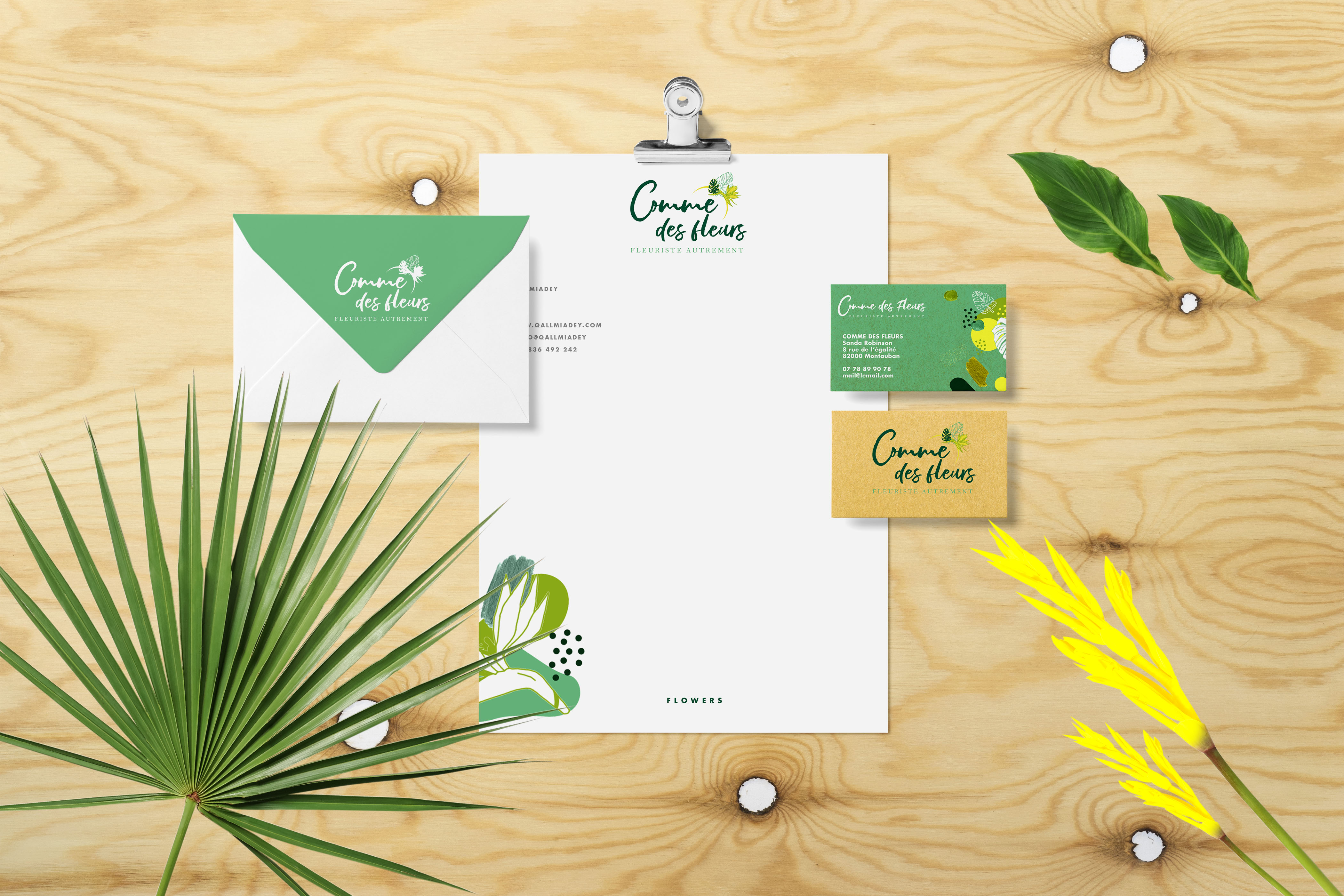
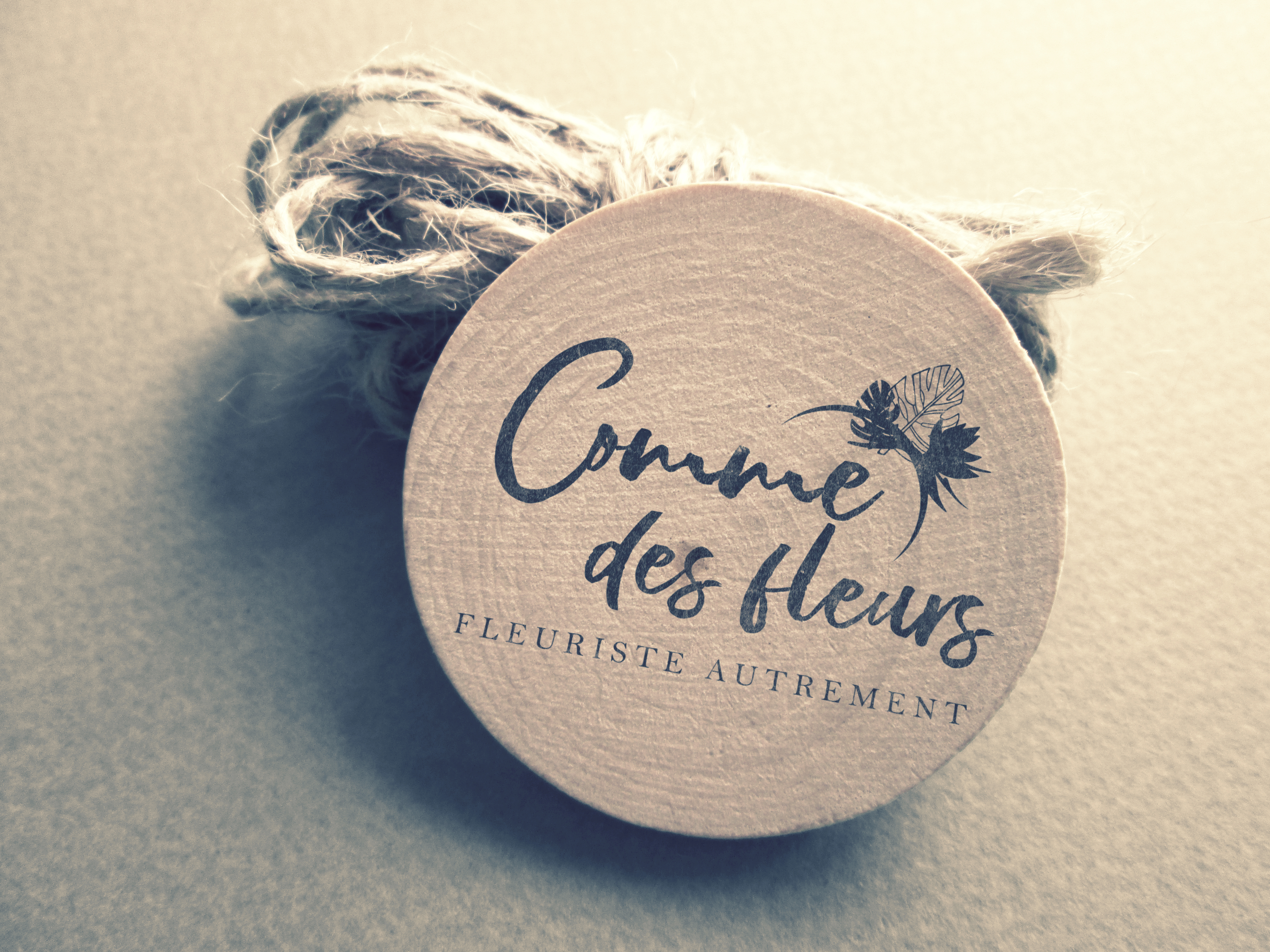
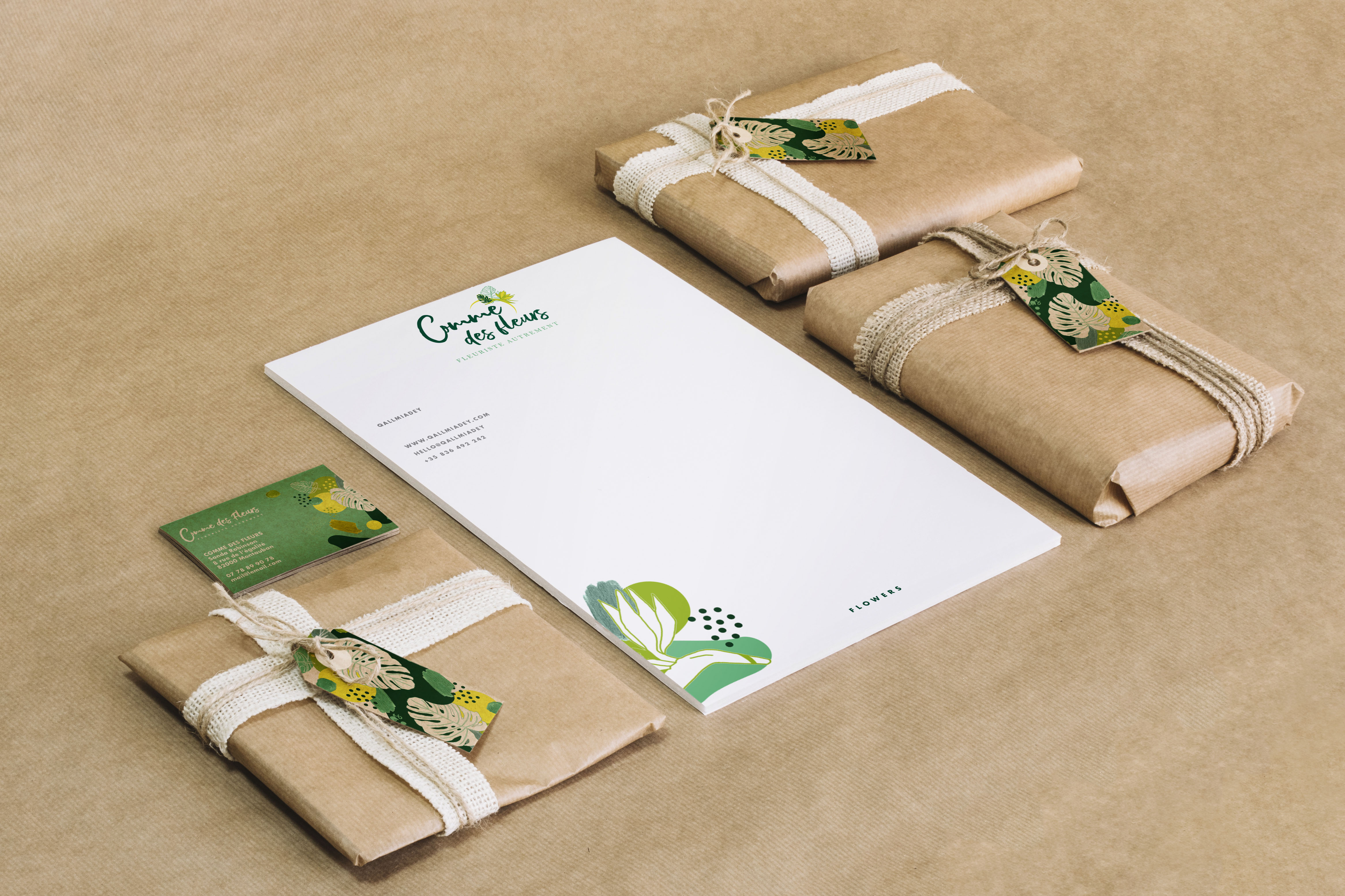
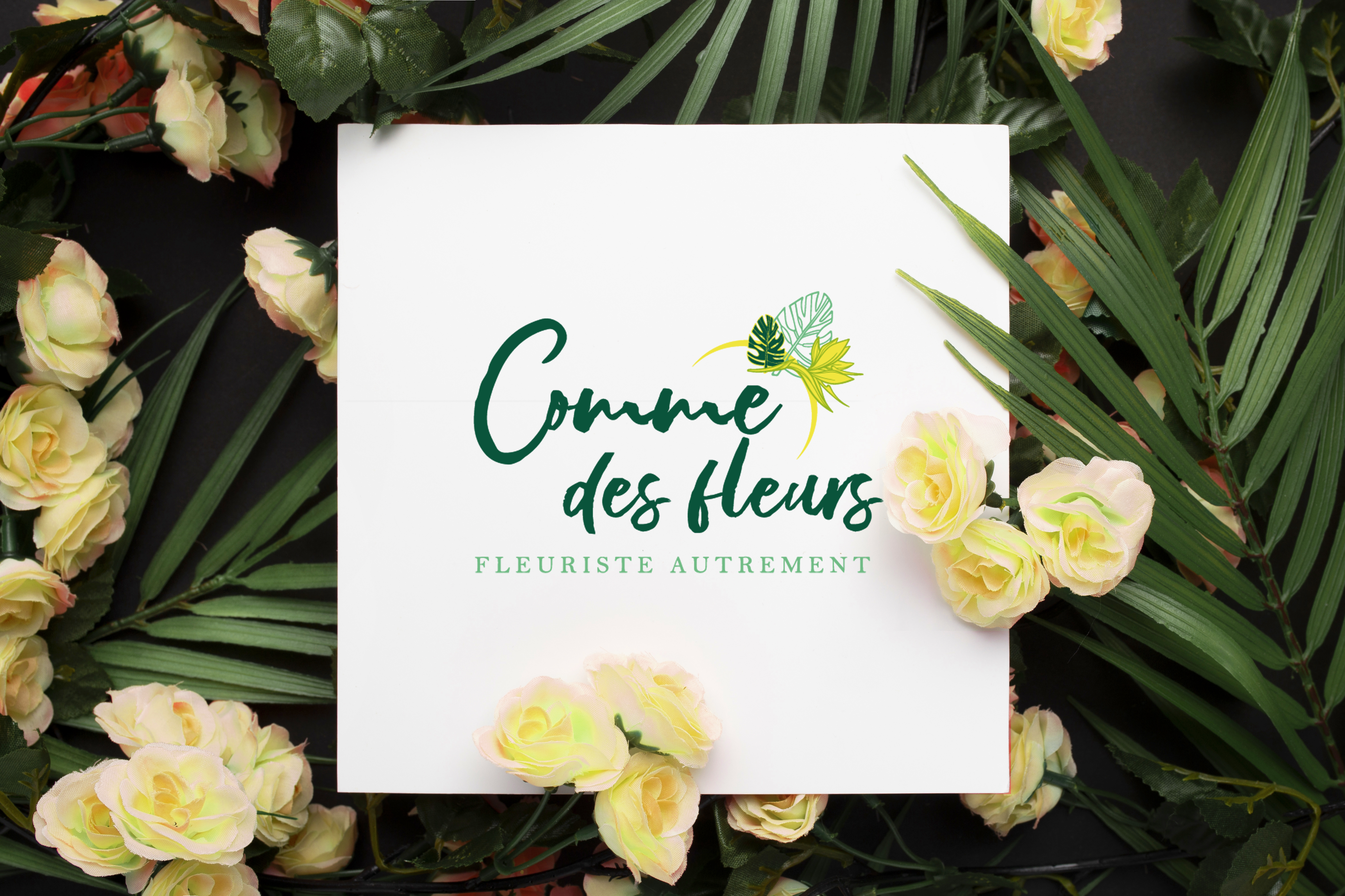
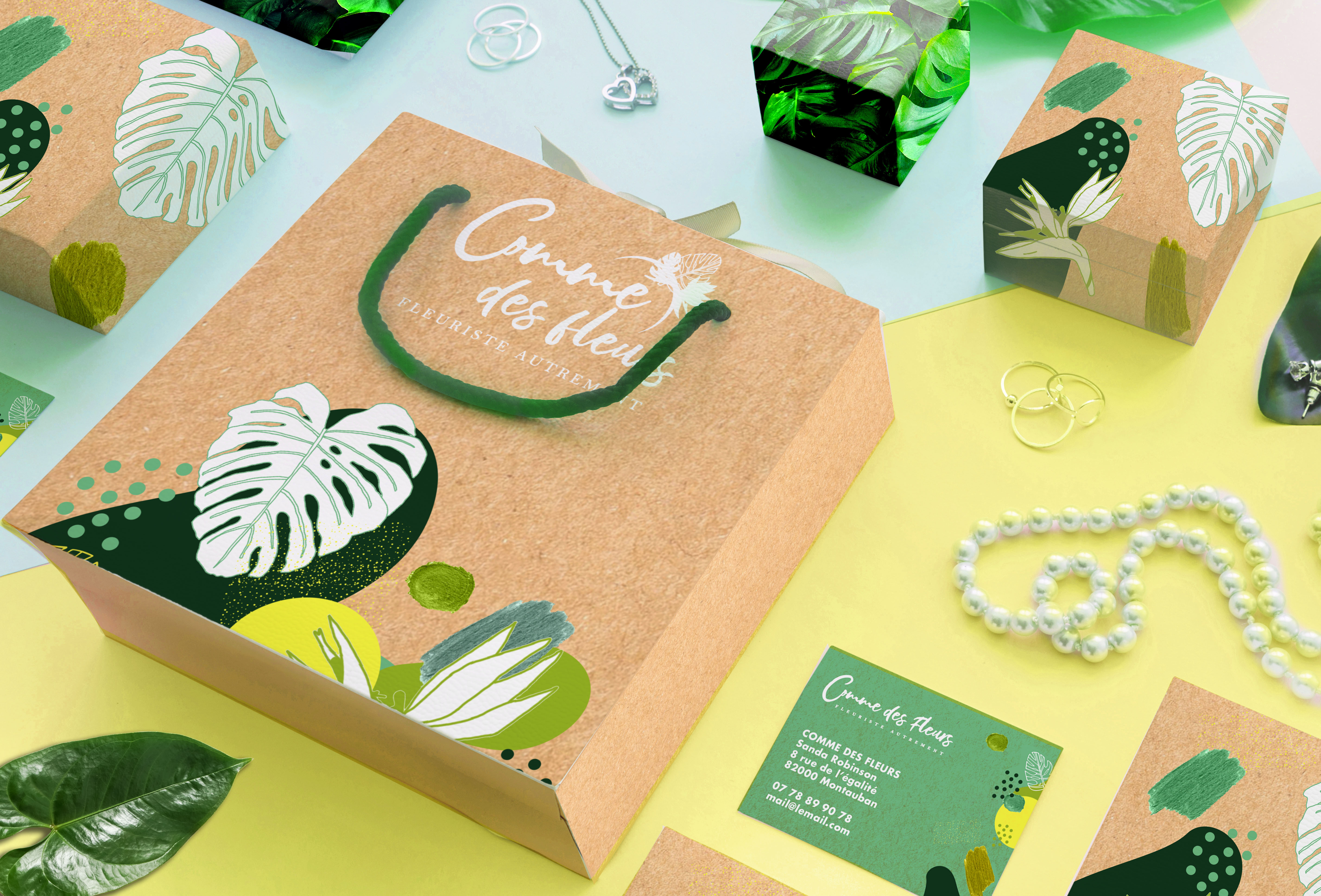
A fresh, nature-inspired branding project for Comme des Fleurs—a floral studio redefining the art of flower arrangement through modern simplicity and organic design. The identity balances elegance with a handcrafted feel, using botanical patterns, earthy textures and a refined colour palette of greens and yellows to evoke natural harmony and sustainable craftsmanship.
Challenge
Comme des Fleurs needed a cohesive identity that communicated both artistry and authenticity in the competitive floral design space. The challenge lay in combining a delicate, environmentally conscious tone with strong visual recognition. It was essential that the brand remained flexible across packaging, stationery, signage and digital touchpoints while preserving its artisanal charm.
Solution
The solution centred on a clean, expressive visual system integrating organic illustrations, handwritten typography and eco-friendly materials. Each element—from the kraft packaging to the digital layouts—carries a consistent natural flow, reinforcing the studio’s philosophy of “floristry differently.” The resulting identity feels grounded yet uplifting, creating an experience that celebrates beauty, nature and thoughtful design at every interaction.
